Designing Oleh-Oleh Brand “Tjitarum” Through The Eyes Of Sereal Design Studio
Bandung, Indonesia-born souvenir shop Tjitarum is officially introduced with an identity that reflects the character of West Java. Embracing a direction rooted in Sundanese (West Java’s tribe) culture and identity, the decision to name it “Tjitarum,” like the river, stems from extensive research. The Citarum River, one of West Java’s most significant geographical and cultural landmarks, became the core inspiration. This lifeline of the Sundanese region flows across the province and is closely tied to the ancient Tarumanegara Kingdom. The kingdom’s historic trade routes, which also ran along the river, were known for their abundant Tarum (indigo) plants, a natural dye that has long influenced the colors found throughout West Java. In this creative spotlight installment, EnVi dives into Sereal Design Studio’s process of designing Tjitarum.


About Tjitarum and Their Locally-Sourced Snacks
Tjitarum is a modern souvenir (oleh-oleh) store that revives the unseen charm and beauty of West Java through creation, flavor, and memory. Rooted in the story of Citarum River – a source of life for countless communities, and home to the thriving indigo (Tarum) plant – each branding detail reflects a quiet harmony between heritage and the present, shaped with a gentle relevance for today.
“Ngamumule Rasa – Ngahargaan Carita” – meaning the act of honoring stories and heritage, lives up to Tjitarum’s mission to deliver flavors that feel close to the soils of West Java. Pumpkin, banana, coconut, pineapple, pandan, cassava, and black glutinous rice – all these ingredients live and grow here, and their presence has always accompanied Sundanese people in their daily lives.
Oleh-Oleh as a Love Language
“Sereal sees oleh-oleh as a part of city branding that also contributes in representing Indonesian culture. The opportunity to deliver this through oleh-oleh is huge and endless – with lots of iterations to create. More than that, oleh-oleh is a beloved symbol of gift-giving for Indonesian people. It is gifted after travelling, or during special occasions such as religious events. In this country, oleh-oleh is an integral part of the tradition and will always continue that way,” shared Nicky Borneo, Founder & Creative Director of Sereal Design Studio.
Hence why, Tjitarum was developed in collaboration with various experts – from artisans to cultural advocates – to ensure that every detail authentically represents West Java.
Tarum-inspired Visual Identity
With its visual identity designed by Bandung’s Sereal Design Studio, Tjitarum’s character is deeply-rooted in indigo plants, a strong symbol in Sundanese culture. With the aim to unlock West Java’s beauty, the Sereal team deepens the analog research process. Sereal learned about indigo coloring at Pekalongan, in order to work on cyanotype and watercolor. This process extended to extracting the essence of local ingredients such as peuyeum and ketan hitam became a part of their research process for Tjitarum. With this approach, Sereal redefines West Java’s allure through the indigo color spectrum, and gives it life in the form of cultural landscapes, community stories, and local values.
Analog Process as Tjitarum’s Driving Force
Tjitarum’s logotype is made slanted, referring to the Sundanese script that was originally written in palm leaves during ancient times. The leaf’s fiber – which is naturally sloped – requires people to write it horizontally, in order to not break the fiber. This historical approach is translated into contemporary design by Sereal.
The color on Tjitarum’s brand identity is also made in gradation, following the natural color of indigo plants that is never really solid and sticks to one hue. In this aspect, Sereal also explored manual graphic techniques such as watercolor, reflecting the Citarum river that is always flowing.

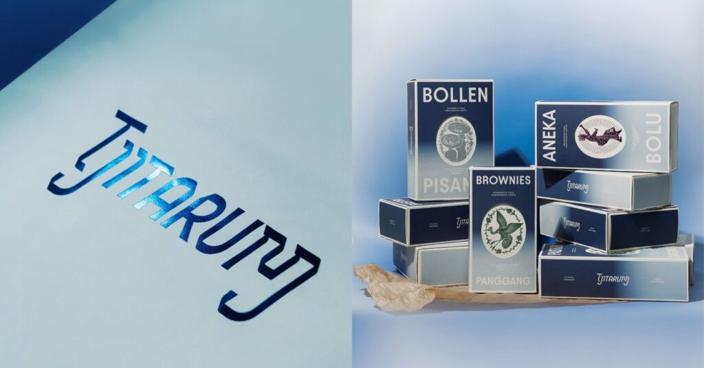
Most of Tjitarum’s design process is manually done – from graphic exploration and coloring to hand-painted facade design. This analog approach becomes Tjitarum’s visual foundation, presenting something that is honest, humane, and close to tradition. Such an example comes in the form of Tjitarum’s packaging – illustrations of various aspects of Sundanese culture adorn the package, all along with the gradation of Tarum color.
Translating Sundanese Culture Into Illustrations
Sereal translates various aspects of Sundanese culture into intricately illustrated packaging for Tjitarum. The color gradation on the box took inspiration from the simulation of fabric being dyed with tarum. The product name is made bold and placed prominently on the front so it is easy for the target market to digest and understand.
The icons – the Heron, Batik from Ciwaringin, Jaipong traditional dance, Garut sheep, and bananas from Tasikmalaya land – serve as an extension to Tjitarum’s value of ngahargaan carita (honoring stories), which is derived from ngamumule rasa (reviving culture). These icons are rarely discussed within the context of West Java, yet they hold significant cultural importance. This project aims to bring them into focus and give them the attention they deserve.
To emphasize their value, the icons are placed on the front and elevated with foil detailing, making them stand out as the “jewels” of the packaging; elements that catch the eye while carrying deeper meaning.


Inside the packaging, a note card welcomes the eye, explaining the icons. Every icon is developed carefully, to honor the cultural narrative in West Java.
How They Wear and Breathe Tradition in Their Sleeve
On the attire side, Tjitarum’s uniform took inspiration from Pangsi – a Sundanese traditional attire. The lining details refer to “Papat Kalima Tunggal,” a philosophical principle rooted in Sundanese thought that is interpreted as a principle of nationhood. It is built on the idea of four fundamental elements that are unified by a single essence. In this view, Papat Kalima Tunggal is not merely a metaphysical or spiritual concept. It offers a way of understanding human beings and society as an inseparable whole, where physical life, nature, and spirituality are interconnected and ultimately return to a single source.


Furthermore, Tjitarum also uses stone elements as a symbol of Sundanese culture’s closeness to nature, complete with sayings of “Hatur Nuhun” (Sundanese for “Thank you”) and “Sampurasun” (Sundanese way of greeting), reflecting local friendliness. In Tjitarum, everything goes back to culture and tradition.
About Sereal Design Studio
Bandung-based graphic design & branding studio Sereal operates like a second thought in one’s mind — a lingering “what if,” a quiet doubt that surfaces just before creating something new, or even the fear of rejection. These feelings have followed the studio since its early days in 2019. Rather than simply translating ideas into objects or sensory experiences, Sereal positions itself in the space between what makes sense and what doesn’t. For the studio, beauty can take any form, as long as it remains relevant to the people who encounter and appreciate their work.
Tune in to Tjitarum’s page on Instagram to see their beautifully designed souvenirs.
Looking for a secondhand shopping session in India? Check out EnVi’s article on GON Vintage here!