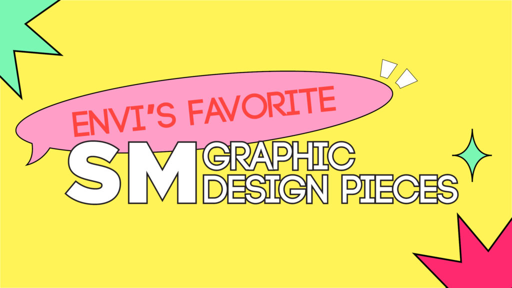
NCT Dream’s “맛(Hot Sauce)” era brought some flavor with the creative use of the cartoon hot sauce bottle, pepper characters, and animation in their promotional content. While fans enjoyed those designs, there are definitely more pieces by SM that stand out. Here are some of Team EnVi’s favorite graphic design pieces from various SM promotional content and artist comebacks!
@_emptydisco
Name: Mal
Role: Chief Creative Officer
Favorite SM Group: NCT
Favorite SM graphic design piece:
NCT 127’s Cherry Bomb mini-album, music video, and teaser images. Taemin’s Never Gonna Dance Again album, teaser images, and other promotional items. NCT 2019 Seasons greetings board game. The one that first comes to mind is the animation/illustration work for the NCT 127’s Cherry Bomb mini-album and music video. The colorful, almost graffiti-like animations and illustrations used on the teasers, on the album, and in the music video added something new and playful to the NCT 127 concept. The bright pinks and yellows, the graphic illustrations, all were very eye-catching and matched the tone and feel of the music!
NCT 127 🍒'CHERRY BOMB'💣
2017.06.14 6PM(KST) #NCT #NCT127 #CherryBomb pic.twitter.com/Gxlp1rkEpI— NCT (@NCTsmtown) June 9, 2017
#NCT127 세 번째 미니앨범 'NCT #127 CHERRY BOMB' 📅2017.06.14 6PM(KST) 전곡 음원 공개 #NCT #CherryBomb #체리밤 pic.twitter.com/7PJQXcdnuE
— NCT (@NCTsmtown) June 5, 2017
I also loved Taemin’s Never Gonna Dance Again ACT 2, more specifically the album design and teaser photos. This concept as a whole was BEAUTIFUL! It fits the aesthetic that Taemin has set for himself and can be continued on. I loved the thin, twisty serif font and the ‘archway’ cut-out used on the packaging. It made you think of religious imagery without doing it in an obvious manner. I really liked how they use ALL of the design trends.
TAEMIN 태민 The 3rd Album [Never Gonna Dance Again : Act 2]
🎧 2020.11.09. 6PM KST
👉🏻 https://t.co/jNROmgIA5F#태민 #TAEMIN #샤이니 #SHINee#NeverGonnaDanceAgain#Act2 #IDEA #이데아 pic.twitter.com/pmr58ifhRl— SHINee (@SHINee) October 29, 2020
My runner-up would be the NCT 2019 Season’s Greetings. I thought it was clever that they included a little board game with NCT members as game pieces. I do wonder how many people used them though. I believe that the illustrated pieces and the colors are what really made the design pop. The photography, new design trends, and the concept itself were innovative and new. I haven’t seen anything like that before.
@regularsprout
Name: Elise
Role: Web Developer, Graphic Designer
Favorite SM Groups: EXO, NCT
Favorite SM graphic design piece:
EXO’s logo is simple and so easy to memorize. I remember drawing it everywhere when EXO debuted. I like that they made so many versions over the years but you are still able to recognize EXO and read EXO on the logo.
EXO’S COMEBACK LOGOS NEVER DISAPPOINT 😭👏🏼#EXO @weareoneEXO #DONT_FIGHT_THE_FEELING pic.twitter.com/im943D9k1j
— 쉰花 ❄️ (@xunhuas) May 10, 2021
@ngogejat
Name: Mendy
Role: Writer, Graphic Designer
Favorite SM Group: NCT
Favorite SM graphic design piece:
The GIF teasers and the concept/aesthetic for F(x)’s “4 Walls”, and the album for Pink Tape. Both of these concepts and ideas were extremely creative and unique for K-pop. To my memory, there hasn’t been any other design or execution like it even now, years after they have been released. With the VHS styling of Pink Tape, it meshed beautifully with the unique vintage sound of the album and played with ideas of modern (CD) and old music formats. For the “4 Walls” teasers, the very simplified color scheme with the moving parts of the photo made it feel like an actual standalone art piece, rather than just a teaser. It also corresponded well to the sound and vibe of the album. It really demonstrated SM’s role as the blueprint for a lot of K-pop design concepts.
F(x) 4Walls Album Done ✅ #Fx #Fxalbum #4walls #smtown pic.twitter.com/r8TAJ63IUj
— Tan 💥 (@Kv9696) March 24, 2021
@yangsbff
Name: Andreea
Role: Graphic Designer
Favorite SM Groups: EXO, NCT/WayV
Favorite SM graphic design piece:
WayV’s logo for Take Over the Moon and the album design. It’s my favorite WayV logo so far and I like how it suggests the concept of the album. This era also gives off a sense of royalty through the typography and concept photos. The ring around the V and the moon in the middle definitely stand out in the logo for me. For the album design, I like the gold details on the cover and on the edges of the pages. The layout of the pages in the photobook is simple but really well put together and with some interesting touches. I love the combination of the photos with the celestial illustrations. I think it’s cool how they used translucent pages in the album as well.
WayV_‘Take Over The Moon – The 2nd Mini Album’_Teaser Calendar
⠀#WayV #WeiShenV #威神V pic.twitter.com/WyaXt4zTMJ— WayV (@WayV_official) October 22, 2019
[INFO] WayV – Take Over The Moon Physical Album Details (1/3)
• Album Box + CD
• Random Photocard (1)
• Random Circle Card (1)
• Group Poster (1)
• Booklet (1)#WayV #WeiShenV #威神V @WayV_official pic.twitter.com/fe2WPE5OXl— WayV Updates #OnMyYouth (@weishenvupdate) November 7, 2019
@Gtroubleartist
Role: Creative Director/Deputy Editor
Favorite SM Group: SuperM
Favorite SM graphic design piece:
I really love EXO’s logo! I love how it can evolve and change, yet you can still read “EXO” there. It’s fluid based on their concept but still maintains their identity. The subtlety of EXO pops out to me, and that’s why I like The War era logo the most. I think it’s genius, and no other SM group’s logo has that.
View this post on Instagram
@valschwarie
Name: Valerie
Role: Senior Writer
Favorite SM Groups: EXO, NCT
Favorite SM graphic design piece:
My favorite pieces are Red Velvet’s “Russian Roulette” era content and æspa’s “Next Level” teasers by Cece Liu, Rodolfo Hernández, and Bryan Huynh. The promotional content and music video for Red Velvet’s “Russian Roulette” comeback were simply fun and cute! Even the logo, a pastel yellow heart with an arrow the shape of the words “Russian Roulette” piercing through it, is a work of art on its own. In the video, the transitions between scenes and backgrounds were vivid. In addition, the video even featured a black and white cartoon mouse that chased a cat around to depict explicit scenes of violence. What stands out most is the use of juxtaposition for different aspects of the visual content. The song’s bubbly sound is reflected by the bright color palette and bubbly graphics and animation, while the darker theme and meaning behind the song are reflected by the acts of violence done by the animated characters in the video. The animated characters are also eye-catching since they are depicted in black and white animation while the rest of the content is so colorful.
View this post on Instagram
As for æspa’s teasers, I genuinely adore the video game feeling I get from the CGI animation. The visuals are breathtaking and the members look awesome. The lighting and intricate details in the background made me feel as though I was seeing a teaser for an epic tale. It helps with world-building for æspa’s overall concept. I loved getting a glimpse of the infamous KWANGYA, mentioned both by æspa and NCT. Contrasting with the simple visuals in “Russian Roulette” content, æspa’s teasers stand out for the amount of intricate detail they possess. Each item— including the member’s individual styling— was done so that the members are the focal point of the images and exude a powerful, protagonist aura. I think what pops out most is the overall tone of the piece! It’s like the teaser of a superhero story!
에스파 'Next Level', 美 빌보드 차트 2주 연속 차트인!
글로벌 200 차트, 지난주보다 32계단 상승한 65위!aespa enters the Billboard Global 200 chart for 2 weeks in a row, rising by 32 ranks from last week!https://t.co/7EqlteKoNS#aespa #æspa #에스파#NextLevel pic.twitter.com/CJg4ymmbSt
— aespa (@aespa_official) June 3, 2021
K-pop fans can expect high-quality designs across various media formats because SM Entertainment adopted their own “CAWMAN”—Cartoon, Animation, Motion Graphics, Avatar, Novel—style of storytelling. The company started adopting CAWMAN storytelling elements with their SM Culture Universe live-action short film. This video expanded on æspa’s “Black Mamba” lore, which featured avatars, motion graphics, webtoons, and CGI animation. SM Entertainment can continue to explore their artists’ concepts with mixed-media content for fans to look forward to in future comebacks.
Thumbnail by Chi